Grid
Guiding principle: Be consistent.
About this component
The grid system gives structure to your page and helps to organize the page content consistently across different devices. We use a 12-column responsive grid system made up of columns, gutters and margins.
All of our components have been built and tested on this grid system.
Columns
Columns hold a page’s main body content. One piece of content can be assigned to fill multiple columns. The number of columns assigned to a piece of content determines the width of that piece of content.
Column width is defined using percentages, rather than fixed values, to allow content to flexibly adapt to any screen size. Our 12-column grid always divides the available space into 12 columns, regardless of screen size. In order to make it easier to arrange content for different sized screens, a piece of content can be assigned a different number of columns for each breakpoint range (a range of predetermined screen sizes) at which a screen is viewed, whether it’s a breakpoints for mobile (small), tablet (medium) and desktop (large) screen sizes.

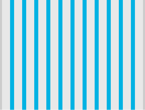
Gutters
Gutters are the spaces between columns. They help separate content.
Gutter widths are fixed values that do not adjust to screen size. For our 12-column grid, there is always a gutter of 16 pixels on each side of a column.
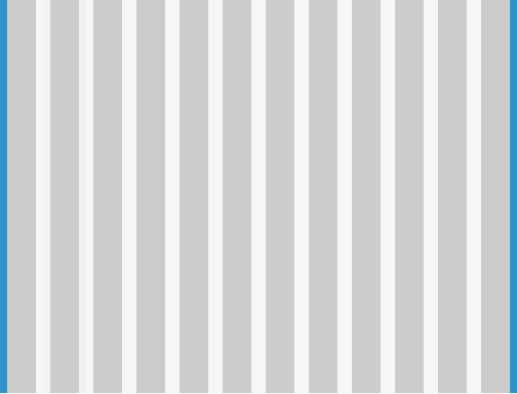
Margins
Margins are the space between the content area and the left and right edges of the screen. To better adapt to the screen, the margin width can change at different breakpoints. For our 12-column grid, we’ve set the margin for small and medium breakpoints to 16 pixels — the same value as our gutters. For desktop screens at large breakpoint sizes, we’ve set the margin to automatically adjust. This keeps the main content area centered on the page on large screens, even after the main content area stops widening.
Breakpoints
We’ve modified our grid system to better fit the needs of Ontario.ca. You should also use these breakpoints for transactions and applications that are not built on Ontario.ca:
- small for 0px to 639px (< 40em)
- medium for 640px to 1167px (40em to < 73em)
- large for 1168px to 1535px (73em to < 96em)
We have two larger breakpoints, which can be used when styling elements that span the whole page area:
- x-large for 1536 to 1919px (96em to < 120em)
- xx-large for 1920px and above (120em and above)
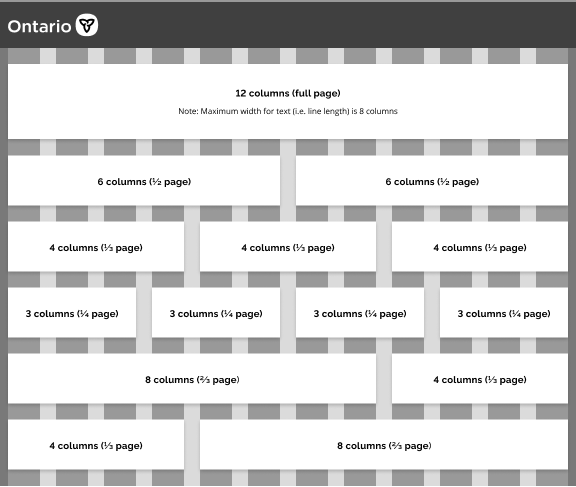
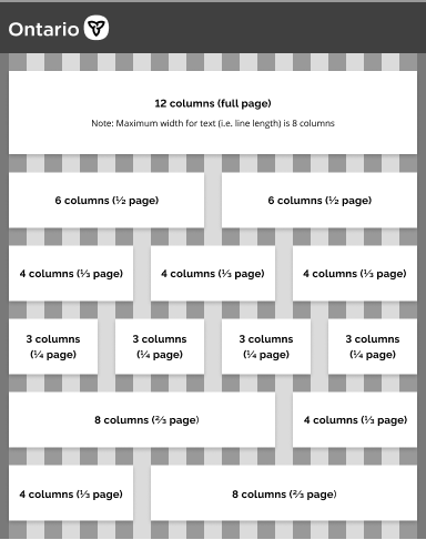
Grid column options
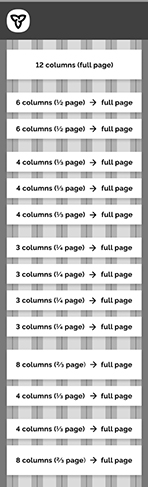
The width of content areas on a page is based on our 12-column grid. Any section of content can be up to 12 columns wide, and can be divided up into smaller containers. To follow best practices, you can choose to implement:
- one full 12-column container
- two containers of six columns each
- three containers of four columns each
- four containers of three columns each
- one container of eight columns and one container of four columns
- one container of four columns and one container of eight columns
For mobile, most elements will take up the full width of the page regardless of their size on desktop. For example, if an element is four columns wide on desktop, it will still display as full width on mobile. There are some exceptions, such as icons or text inputs with overrides.
Grid push and pull classes
The grid push and pull classes are used to rearrange the content on a webpage, but they should be used with caution as they alter the visual order of the grid without changing the underlying HTML DOM structure. This can cause issues for those using assistive technology. It is recommended to keep the visual order as close as possible to the DOM order.
If you use the grid push and pull classes to rearrange your content, please note that it may result in an incorrect tabbing order or announcement order of the content for those using assistive technology.
Other resources
Our 12-column grid is a modified version of the grid from Foundation 5. Learn more about how to use the Foundation 5 grid.
Here’s how Material Design describes columns, gutters and margins.
If you have any questions or feedback, please get in touch.