-
Content:
@use '@ongov/ontario-design-system-global-styles/dist/styles/scss/1-variables/colours.variables' as colours; @use '@ongov/ontario-design-system-global-styles/dist/styles/scss/1-variables/spacing.variables' as spacing; @use '@ongov/ontario-design-system-global-styles/dist/styles/scss/1-variables/font-weights.variables' as fontWeights; .ontario-date__group { display: flex; label { font-weight: fontWeights.$ontario-font-weights-semi-bold; } input { margin-top: spacing.$spacing-4; } } .ontario-date__group-input { display: flex; flex-direction: column; margin-right: spacing.$spacing-5; } .ontario-date--error { input { border: 0.125rem solid colours.$ontario-colour-alert; } } - URL: /components/raw/dates/dates.scss
- Filesystem Path: fractal/components/components/forms-and-inputs/dates/dates.scss
- Size: 700 Bytes
-
Content:
.ontario-date__group{display:flex}.ontario-date__group label{font-weight:600}.ontario-date__group input{margin-top:1rem}.ontario-date__group-input{display:flex;flex-direction:column;margin-right:1.5rem}.ontario-date--error input{border:.125rem solid #cd0000} - URL: /components/raw/dates/dates.css
- Filesystem Path: fractal/components/components/forms-and-inputs/dates/dates.css
- Size: 258 Bytes
Guiding principle: Help the user be successful the first time.
About this guidance
Date inputs ask users to enter a date that may include the day, month, and/or year. Sometimes a calendar picker is combined with a date input to help users choose a date, usually for scheduling.
This guidance is for dates displayed on web pages and applications. It is focused on usability in user interfaces and does not cover how to store information in back-end systems.
The type of date you need will determine the type of date input and display pattern you use.
Exact dates
This includes:
- a date the user already knows
- a date the user can look up without using a calendar
- a date that doesn’t require the user to know the day of week
- all three elements of a date (day, month, year)
For example:
- birth, death, marriage, separation dates
- expiry dates, registration dates
Best practices
Use clearly labeled input fields for this type of information. This reduces any ambiguity when users enter a date or need to interpret a completed date input field.
Example

Do
- Follow the ISO 8601 format YYYY-MM-DD where the date values are ordered from largest to smallest unit of time.
- Allow users to input single or double digits in the month or day field. For example, “3” and “03” are both valid for March.
- Use appropriately sized inputs based on the length of the expected output (for example, two-character length input fields for date/month and four-character length input fields for the year).
- Limit the number and/or type of characters the user can input.
- Leave the input fields blank.
- Specify the required date format by using hint text under the label.
Don’t
- Put placeholder or hint text within the input field. Users may forget the required format once they start typing over the example.
- Use auto-tab to automatically move the user’s cursor to the next text input.
Approximate dates
An approximate date is:
- a date the user may not know the exact day of
- a date the user may struggle to remember
For example, this could be:
- an event where an exact date is not essential or top of mind (beginning of symptoms, graduation, when they moved, or got their first driver’s license)
- publication dates
Limit the input fields to ask for only what you need. Don’t make users worry about getting an exact date if they don’t need to.
Example

Limited date options
- Use a dropdown list when you need to limit the answers to fewer than 12 options (for example when something only occurs during certain months of the year, or has only occurred in the last few years)
- Consider radio buttons when you have two to three specific dates to choose from.
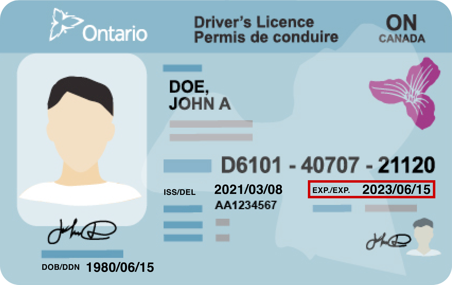
Dates sourced from official documents and cards
Follow the format of the original document. This makes it easier for users to copy the date, especially if it is a date that is not personally familiar to the user.
Example

Error handling
See error messaging for detailed guidance on handling errors in forms. For date inputs, validate each input field and provide users with clear, specific messaging about missing or incorrect information.
Example


Standalone date display
When you need to display a date back to the user as stand-alone information or to provide an official record of the date, spell the month out in full for readability and clarity.
Example
Calendar pickers (coming soon)
Calendar pickers allow users to select a date from a calendar interface when completing a date input field. They can help users in scenarios that involve scheduling (for example, when making an appointment) by allowing users to visualize the date relative to other days.
Do
- Ensure the calendar picker is keyboard accessible.
- Allow users to manually type in a date if they are not able or do not want to use the calendar interface.
- Set appropriate defaults to help users select the date they want – for example, don’t allow selection of past dates or unavailable dates for appointment booking.
- Ensure you test your calendar picker implementation with assistive technologies and a variety of devices.
- Only use a calendar picker for dates within a year in the past or future.
Don’t
- Use a calendar picker unless it adds value for your specific date input scenario – stick with simple date input fields whenever possible.
- Use a calendar picker when asking users to input their date of birth or other types of exact/known dates.
If you have any questions or feedback, please get in touch.