Cards
Use a card to provide an entry point to information on a different page.
-
Content:
@use 'sass:math'; @use '@ongov/ontario-design-system-global-styles/dist/styles/scss/1-variables/global.variables' as globalVariables; @use '@ongov/ontario-design-system-global-styles/dist/styles/scss/1-variables/spacing.variables' as spacing; @use '@ongov/ontario-design-system-global-styles/dist/styles/scss/1-variables/colours.variables' as colours; @use '@ongov/ontario-design-system-global-styles/dist/styles/scss/1-variables/breakpoints.variables' as breakpoints; @use '@ongov/ontario-design-system-global-styles/dist/styles/scss/2-tools/placeholder/focus.placeholders' as placeholders; @use '@ongov/ontario-design-system-global-styles/dist/styles/scss/1-variables/font-weights.variables' as fontWeights; @use '@ongov/ontario-design-system-global-styles/dist/styles/scss/1-variables/font-sizes.variables' as fontSizes; @use '@ongov/ontario-design-system-global-styles/dist/styles/scss/2-tools/functions/global.functions' as globalFunctions; @use '@ongov/ontario-design-system-global-styles/dist/styles/scss/1-variables/typography.variables' as typography; .ontario-card__container { display: flex; flex-wrap: wrap; justify-content: flex-start; align-items: stretch; gap: spacing.$spacing-6; margin: spacing.$spacing-0; padding: spacing.$spacing-0; @media screen and (max-width: breakpoints.$small-breakpoint) { gap: spacing.$spacing-0; flex-direction: column; } } .ontario-card { box-shadow: 0rem 0.1875rem 0.5rem 0.0625rem rgba(0, 0, 0, 0.4); border-radius: globalVariables.$global-radius; overflow: hidden; padding: spacing.$spacing-0; list-style-type: none; transition: all 0.3s ease-in-out; position: relative; cursor: pointer; background: colours.$ontario-colour-white; flex: 0 1 auto; &:hover { box-shadow: 0rem 0.375rem 0.75rem 0.125rem rgba(0, 0, 0, 0.35); } &:focus-within { box-shadow: placeholders.$ontario-focus-box-shadow; outline: globalFunctions.px-to-rem(4) solid transparent; transition: box-shadow 0.1s ease-in-out; } &:active { box-shadow: placeholders.$ontario-focus-box-shadow; } .ontario-card--cards-per-row-4 & { width: calc(25% - 2rem); &:nth-child(4n) { margin-right: spacing.$spacing-0; } } .ontario-card--cards-per-row-3 & { width: calc(33.3333% - 1.75rem); &:nth-child(3n) { margin-right: spacing.$spacing-0; } } .ontario-card--cards-per-row-2 & { width: calc(50% - 1.25rem); &:nth-child(2n) { margin-right: spacing.$spacing-0; } } @media screen and (max-width: breakpoints.$medium-breakpoint) { .ontario-card--cards-per-row-4 & { width: calc(50% - 1.25rem); &:nth-child(2n) { margin-right: spacing.$spacing-0; } } } @media screen and (max-width: breakpoints.$small-breakpoint) { margin-bottom: spacing.$spacing-6; width: 100% !important; // to override the specificity of the widths listed for the card-rows max-width: 100%; } } .ontario-card--position-horizontal { display: flex; width: 50%; @media screen and (max-width: breakpoints.$small-breakpoint) { width: 100%; max-width: 100%; } .ontario-card__image-container, .ontario-card__text-container { position: relative; } a { &:focus-within { box-shadow: none; outline: none; } &:active { box-shadow: none; } } img { height: 100%; position: absolute; } } .ontario-card--position-horizontal__image-right { flex-direction: row-reverse; } .ontario-card__heading { @extend %h4-styles; margin: spacing.$spacing-0; padding: (spacing.$spacing-5 - spacing.$spacing-1) spacing.$spacing-5 spacing.$spacing-2 spacing.$spacing-5; transition: text-decoration 0.3s ease-in-out; background-color: colours.$ontario-colour-white; max-width: none; .ontario-card:hover & { text-decoration-line: underline; text-decoration-color: colours.$ontario-colour-black; } .ontario-card--light & { background-color: colours.$ontario-greyscale-5; padding-top: spacing.$spacing-4; padding-bottom: spacing.$spacing-4; } .ontario-card--dark & { background-color: colours.$ontario-colour-black; padding-top: spacing.$spacing-4; padding-bottom: spacing.$spacing-4; } .ontario-card--dark:hover & { text-decoration-line: underline; text-decoration-color: colours.$ontario-colour-white; } .ontario-card--no-description & { padding: spacing.$spacing-4 spacing.$spacing-5; } a { color: colours.$ontario-colour-black; text-decoration: none; outline: none; .ontario-card--dark & { color: colours.$ontario-colour-white; } &::after { content: ''; position: absolute; left: 0; top: 0; right: 0; bottom: 0; } &:focus { box-shadow: none; } &:active { outline: none; } } @media screen and (max-width: breakpoints.$medium-breakpoint) { font-size: fontSizes.$ontario-font-size-large; padding-left: spacing.$spacing-4; padding-right: spacing.$spacing-4; } } .ontario-card__text-container { .ontario-card--position-horizontal & { width: math.percentage(math.div(2, 3)); } .ontario-card--image--one-fourth & { width: 75%; } .ontario-card--no-image & { width: 100%; } } .ontario-card__description { margin: spacing.$spacing-0; padding: spacing.$spacing-2 spacing.$spacing-5 spacing.$spacing-5 spacing.$spacing-5; background-color: colours.$ontario-colour-white; p { margin-top: spacing.$spacing-0; } p:last-of-type { margin-bottom: spacing.$spacing-0; } .ontario-card--light &, .ontario-card--dark & { padding-top: spacing.$spacing-4; } @media screen and (max-width: breakpoints.$medium-breakpoint) { padding: spacing.$spacing-2 spacing.$spacing-4 spacing.$spacing-5 spacing.$spacing-4; .ontario-card--light &, .ontario-card--dark & { padding-top: spacing.$spacing-4; } } } .ontario-card__image-container { .ontario-card--position-horizontal & { width: 33.3%; } .ontario-card--image--one-fourth & { width: 25%; } } .ontario-card__image { width: 100%; object-fit: cover; background-size: 100% 100%; .ontario-card--position-horizontal__image-right & { height: 100%; } .ontario-card--position-horizontal__image-left & { height: 100%; } } .ontario-card--light.ontario-card--no-description { background-color: colours.$ontario-greyscale-5; } .ontario-card--dark.ontario-card--no-description { background-color: colours.$ontario-colour-black; } - URL: /components/raw/cards/cards.scss
- Filesystem Path: fractal/components/components/page-content/cards/cards.scss
- Size: 6.3 KB
-
Content:
.ontario-card__heading{font-style:normal;font-weight:700;text-rendering:optimizeLegibility;margin-bottom:1rem;font-feature-settings:normal;font-family:"Raleway Modified","Open Sans","Helvetica Neue",Helvetica,Arial,sans-serif}.ontario-card__heading{font-size:1.25rem;letter-spacing:.03rem;line-height:1.5;margin:0 0 .75rem 0;max-width:48rem}@media screen and (min-width: 40em){.ontario-card__heading{font-size:1.5rem;letter-spacing:.0313rem;line-height:1.5}}.ontario-card__container{display:flex;flex-wrap:wrap;justify-content:flex-start;align-items:stretch;gap:2rem;margin:0;padding:0}@media screen and (max-width: 40em){.ontario-card__container{gap:0;flex-direction:column}}.ontario-card{box-shadow:0rem .1875rem .5rem .0625rem rgba(0,0,0,.4);border-radius:4px;overflow:hidden;padding:0;list-style-type:none;transition:all .3s ease-in-out;position:relative;cursor:pointer;background:#fff;flex:0 1 auto}.ontario-card:hover{box-shadow:0rem .375rem .75rem .125rem rgba(0,0,0,.35)}.ontario-card:focus-within{box-shadow:0 0 0 4px #009adb;outline:.25rem solid transparent;transition:box-shadow .1s ease-in-out}.ontario-card:active{box-shadow:0 0 0 4px #009adb}.ontario-card--cards-per-row-4 .ontario-card{width:calc(25% - 2rem)}.ontario-card--cards-per-row-4 .ontario-card:nth-child(4n){margin-right:0}.ontario-card--cards-per-row-3 .ontario-card{width:calc(33.3333% - 1.75rem)}.ontario-card--cards-per-row-3 .ontario-card:nth-child(3n){margin-right:0}.ontario-card--cards-per-row-2 .ontario-card{width:calc(50% - 1.25rem)}.ontario-card--cards-per-row-2 .ontario-card:nth-child(2n){margin-right:0}@media screen and (max-width: 73em){.ontario-card--cards-per-row-4 .ontario-card{width:calc(50% - 1.25rem)}.ontario-card--cards-per-row-4 .ontario-card:nth-child(2n){margin-right:0}}@media screen and (max-width: 40em){.ontario-card{margin-bottom:2rem;width:100% !important;max-width:100%}}.ontario-card--position-horizontal{display:flex;width:50%}@media screen and (max-width: 40em){.ontario-card--position-horizontal{width:100%;max-width:100%}}.ontario-card--position-horizontal .ontario-card__image-container,.ontario-card--position-horizontal .ontario-card__text-container{position:relative}.ontario-card--position-horizontal a:focus-within{box-shadow:none;outline:none}.ontario-card--position-horizontal a:active{box-shadow:none}.ontario-card--position-horizontal img{height:100%;position:absolute}.ontario-card--position-horizontal__image-right{flex-direction:row-reverse}.ontario-card__heading{margin:0;padding:1.25rem 1.5rem .5rem 1.5rem;transition:-webkit-text-decoration .3s ease-in-out;transition:text-decoration .3s ease-in-out;transition:text-decoration .3s ease-in-out, -webkit-text-decoration .3s ease-in-out;background-color:#fff;max-width:none}.ontario-card:hover .ontario-card__heading{-webkit-text-decoration-line:underline;text-decoration-line:underline;-webkit-text-decoration-color:#1a1a1a;text-decoration-color:#1a1a1a}.ontario-card--light .ontario-card__heading{background-color:#f2f2f2;padding-top:1rem;padding-bottom:1rem}.ontario-card--dark .ontario-card__heading{background-color:#1a1a1a;padding-top:1rem;padding-bottom:1rem}.ontario-card--dark:hover .ontario-card__heading{-webkit-text-decoration-line:underline;text-decoration-line:underline;-webkit-text-decoration-color:#fff;text-decoration-color:#fff}.ontario-card--no-description .ontario-card__heading{padding:1rem 1.5rem}.ontario-card__heading a{color:#1a1a1a;text-decoration:none;outline:none}.ontario-card--dark .ontario-card__heading a{color:#fff}.ontario-card__heading a::after{content:"";position:absolute;left:0;top:0;right:0;bottom:0}.ontario-card__heading a:focus{box-shadow:none}.ontario-card__heading a:active{outline:none}@media screen and (max-width: 73em){.ontario-card__heading{font-size:1.25rem;padding-left:1rem;padding-right:1rem}}.ontario-card--position-horizontal .ontario-card__text-container{width:66.6666666667%}.ontario-card--image--one-fourth .ontario-card__text-container{width:75%}.ontario-card--no-image .ontario-card__text-container{width:100%}.ontario-card__description{margin:0;padding:.5rem 1.5rem 1.5rem 1.5rem;background-color:#fff}.ontario-card__description p{margin-top:0}.ontario-card__description p:last-of-type{margin-bottom:0}.ontario-card--light .ontario-card__description,.ontario-card--dark .ontario-card__description{padding-top:1rem}@media screen and (max-width: 73em){.ontario-card__description{padding:.5rem 1rem 1.5rem 1rem}.ontario-card--light .ontario-card__description,.ontario-card--dark .ontario-card__description{padding-top:1rem}}.ontario-card--position-horizontal .ontario-card__image-container{width:33.3%}.ontario-card--image--one-fourth .ontario-card__image-container{width:25%}.ontario-card__image{width:100%;-o-object-fit:cover;object-fit:cover;background-size:100% 100%}.ontario-card--position-horizontal__image-right .ontario-card__image{height:100%}.ontario-card--position-horizontal__image-left .ontario-card__image{height:100%}.ontario-card--light.ontario-card--no-description{background-color:#f2f2f2}.ontario-card--dark.ontario-card--no-description{background-color:#1a1a1a} - URL: /components/raw/cards/cards.css
- Filesystem Path: fractal/components/components/page-content/cards/cards.css
- Size: 5.1 KB
Guiding principle: Be consistent. Start simple.
About the card component
A card is used to provide a linked entry point to information about a single topic on a different page.
A card always has a title. It may also contain a:
- description
- image
Cards are modular and allow flexibility in their arrangement, without compromising their individual meaning.
Be consistent
Create a seamless user experience by maintaining consistency between the card and the linked page.
For example, use the same language on both the card and the linked page. The result is that the experience meets the expectations set by the card’s content.

When to use this component
Use this when you want to link to a different page.
Only use the card component when:
- you’re designing content that is meant for browsing
- the collection of cards are related in some way
- the design of each card matches the others in a set
When to not use this component
Don’t use this component:
- for only one card — use a callout instead
- for content that follows a specific order — use an ordered list, a table or the grid system instead
- for content with similar titles, such as periodicals — use a list or the grid system instead
- for linking to sections on the same page — use a list or other copy in the body instead
- when you have multiple links or no link — use a list, the grid system or a paragraph in the body instead
Card types
There are two types of cards: standard and horizontal.
Each card comes in style variations, such as:
- coloured header accents
- different aspect ratios for images
Consider content and imagery when you’re deciding on the type of card style to use.
Standard card
The standard card comes in 3 different styles: basic, image and title.
Basic card
This card features a title and description. Use it when the main focus is the content, or if images are not available.

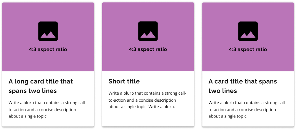
Image card
This card features a title, description and image. Use it when all card features are available.

Title card
This card features a title and image. Use it when the main focus is on the image, or if a description is not necessary.

Horizontal card
This card features a horizontal layout. Use it when there’s more copy and less emphasis on imagery.
It comes in 2 sizes: large and small.
Consider using this card with mobile breakpoints — the condensed height is good for scannability.
Component features: standard card
A standard card has a vertical orientation, with an optional image above the title and description. Standard cards include basic, title and image cards.
- Container (required)
- Card title (required)
- Description (optional)
- Image (optional)
Example
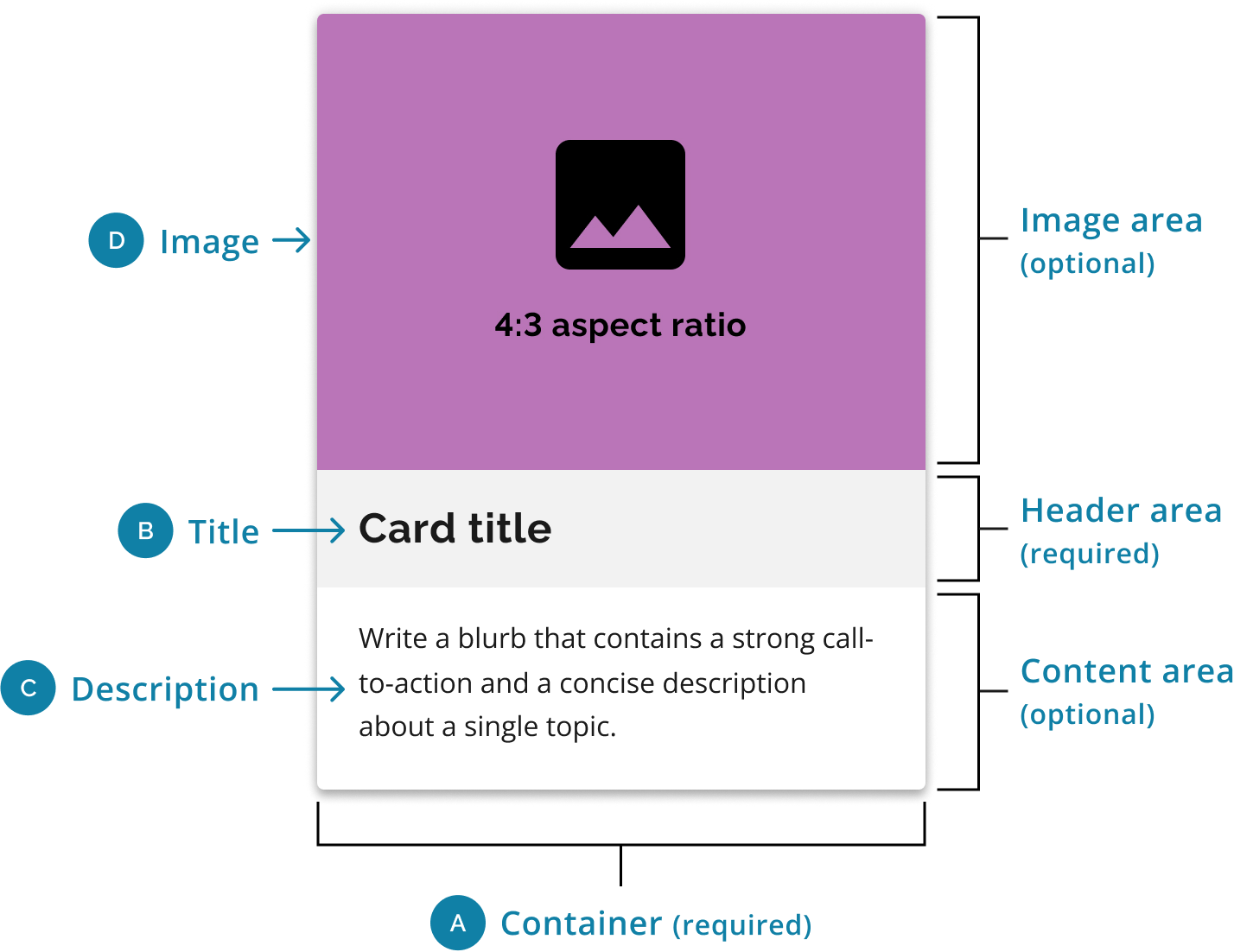
Image (optional)
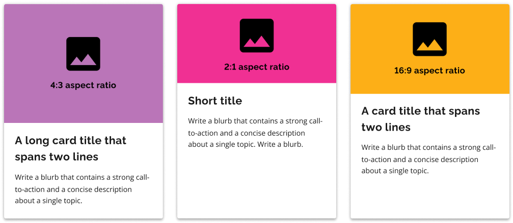
Cards may include one image, such as a photograph, illustration or other static graphic. It should match the main image of the linked page.
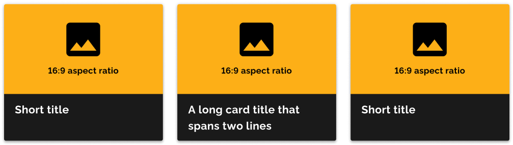
2:1 aspect ratio
Best for smaller illustrations, icons and ultra-wide photographs, such as landscapes and architecture.
16:9 aspect ratio
Best for wide photographs, such as group portraits, landscapes or cropped images.
4:3 aspect ratio
Best for most standard image sizes.

Title (required)
The title describes the linked page. It is often the same as the title of the linked page.
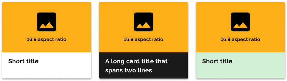
When choosing the colour of the header, use the same colour for all the cards in a set.
Default header
The default header is available with a white background.
Accent header
The accent header is available in the light and base colour palette. It is shown here in the default grey colour.
Dark accent header
The dark accent header is available in the dark colour palette. It is shown here in the default system-black colour. The text is only available in white.

Description (optional)
The description is a blurb that informs the user about what they can expect on the linked page.

Container (required)
The container area is a required element that holds all the card components together. The rounded corners and drop shadow provide visual cues to the user that the card is a clickable element.

Component features: horizontal card
A horizontal card has a horizontal orientation with the optional image on the left or right of the title and description. Horizontal cards include large, small and title cards.
- Container (required)
- Card title (required)
- Description (optional)
- Image (optional)
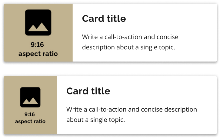
Example
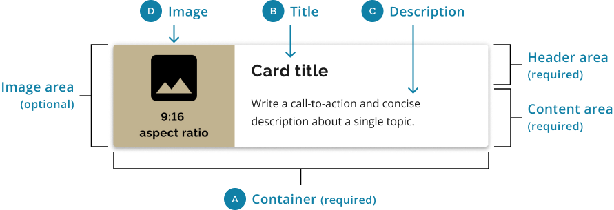
Image (optional)
The aspect ratio used is 9:16. This allows the image to scale vertically depending on the length of the content, and when the card resizes on different breakpoints within the grid.
Large image
The image size uses one-third of the width of the card.
Small image
The image size uses one-quarter of the width of the card.

Header area (required)
Default header
The image size uses one-third of the width of the card.
Small image
The image size uses one-quarter of the width of the card.

Content area (required)
Description
The description is a blurb that informs the user about what they can expect on the linked page.

Container (required)
The container area is a required element that holds all the card components together. The rounded corners and drop shadow provide visual cues to the user that the card is a clickable element.
Best practices
Copy
Do
- Limit the description to a maximum of two short sentences.
- Maintain a consistent character count so that the cards are the same size in the set.
- Use the page title of the linked page as the card title. Shorten it if it’s too long.
- Write copy that accurately conveys the linked page.
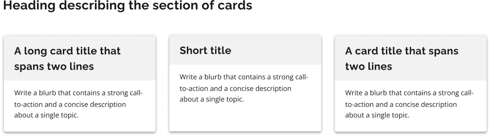
- Include a heading that describes the collection of cards.
Don’t
- Add a button to the card. The entire card is clickable, so it acts as a button already.
- Mix card styles within the same group of cards.
Do this
Don't do this
Design
Do
- Consider how the appearance of the cards will change on different devices.
- Create a grouping of cards — ideally 3 to 4 in one row on desktop.
- Create a grouping of cards with a similar theme. For example, a card that links to services should only be grouped with other service cards.
- Use the same image as the linked page, if the linked page has one.
- Use relevant images that complement the copy.
- Choose the aspect ratio that best fits the card image.
Don’t
- Add a button to the card. The entire card is clickable, so it acts as a button already.
- Mix card styles within the same group of cards.
- Mix aspect ratios within the same group of cards
Do this
Don't do this
Do this
Don't do this
Technical specifications
Use unordered lists and list items for grouping cards
Use a <ul> tag for a card group and a <li> tag for each card.
Wrap the card component in a <ul> tag, so that it:
- groups the card elements together
- enhances the experience for those using assistive technology
This formatting allows screen readers to enumerate the items in the card group and allows shortcuts between individual list items. By providing enumerated information, screen readers keep users informed about the total number of items available.
Use the appropriate heading level for your individual card headings
Card headings must be in the correct, logical outline order. Consider how they fit into the overall structure of the page.
Our code example uses h2 as the heading level, but you will need to update the heading level to suit the structure of your HTML.
Keep the class of ontario-h4 on the element for style purposes.
Use CSS to order the media element
Logically, the media element should follow the header element. Don’t reorganize the markup to reverse their order.
Use content wrapping carefully
Make sure your cards don’t break when:
- lines of content wrap
- images don’t meet specific aspect ratio requirements
Card display specifications
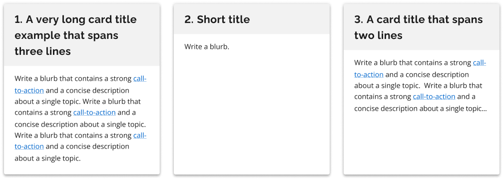
The height of each card component within a group of cards will automatically adjust to match the height of the card containing the most text. This ensures that all the cards have the same height.
The card component provides flexible options for displaying cards within a frame. By applying specific CSS classes to the card element, you can control the number of cards displayed per row and their respective sizes.
Display 4 cards per row
To display four cards in a single row, use the class ontario-card--cards-per-row-4. When this class is applied, each card will occupy 25% of the frame.
This configuration is suitable for larger screens or when you have ample horizontal space.
On tablet-sized screens, the cards will automatically adjust to display 2 cards per row.
Display 3 cards per row
To display three cards in a single row, use the class ontario-card--cards-per-row-3.
Each card will take up approximately 33.3% of the frame.
Display 2 cards per row
To display two cards in a single row, use the class ontario-card--cards-per-row-2. Each card will occupy 50% of the frame.
Horizontal cards, regardless of the number of cards per row specified, will always:
- occupy 50% of the frame
- display 2 cards per row
Mobile display
On mobile devices, all cards will display as a single card per row, occupying 100% of the frame. No additional classes are required for this behaviour.
If you have any questions or feedback, please get in touch.