Dropdown lists
Only use a dropdown (select) list if you cannot use other form components to capture the user’s information.
-
Content:
@use '@ongov/ontario-design-system-global-styles/dist/styles/scss/1-variables/spacing.variables' as spacing; @use '@ongov/ontario-design-system-global-styles/dist/styles/scss/1-variables/colours.variables' as colours; $icon-dir: '../icons' !default; :root { --dropdown-arrow: url('#{$icon-dir}/ontario-material-dropdown-arrow-48px.svg'); } .ontario-dropdown { background-color: colours.$ontario-colour-white; background-image: var(--dropdown-arrow); background-position: right spacing.$spacing-2 center; background-repeat: no-repeat; background-size: spacing.$spacing-6; padding-right: (spacing.$spacing-4 * 2.25); cursor: pointer; } /* These styles are to fix differences in default styling for dropdowns in IE */ .ontario-dropdown::-ms-expand { display: none; } .ontario-dropdown option { font-weight: normal; } - URL: /components/raw/dropdown-lists/dropdown-lists.scss
- Filesystem Path: fractal/components/components/forms-and-inputs/dropdown-lists/dropdown-lists.scss
- Size: 829 Bytes
-
Content:
:root{--dropdown-arrow: url("../icons/ontario-material-dropdown-arrow-48px.svg")}.ontario-dropdown{background-color:#fff;background-image:var(--dropdown-arrow);background-position:right .5rem center;background-repeat:no-repeat;background-size:2rem;padding-right:2.25rem;cursor:pointer}.ontario-dropdown::-ms-expand{display:none}.ontario-dropdown option{font-weight:normal} - URL: /components/raw/dropdown-lists/dropdown-lists.css
- Filesystem Path: fractal/components/components/forms-and-inputs/dropdown-lists/dropdown-lists.css
- Size: 372 Bytes
Guiding principle: Give the user control.
When to use this component
Because some users find them hard to navigate, only use dropdown lists (also known as “select boxes”) when you:
- want the user to choose from a set list of options
- cannot adequately capture the information using other form elements such as radio buttons or a text input field
Dropdown lists usually work well for inputs where:
- there is a specific set of options
- only one option can be selected
- there are only 7 to 15 options
Options in dropdown lists
In general, options should be intuitive for users but should not bias them towards a specific answer.
Number of options
Dropdown lists work best for lists with 7 to 15 options. If there are:
- fewer than 7 options, use a list of radio buttons instead
- more than 15 options, consider a text input field with predicted/type-ahead options
Order of options
Dropdown list options should be listed alphabetically unless there is another logical order. For example, if you’re listing provinces, it would be logical to put Ontario at the top.
Put any “None of the above” or “I do not know” options last.
Choosing a default option
The “default option” is what appears in the dropdown list before the user clicks on it.
Never leave the default option blank.
If the purpose of the dropdown list is to filter results, use the “all” option as the default. For example, this image shows “All categories” as the default option:
Example

Only if you know that 90% or more of your users will choose one of the options you can put that option as the default. In this example, Canada is the default country because, in this case, we’re sure at least 90% of our users will live in Canada:
Example

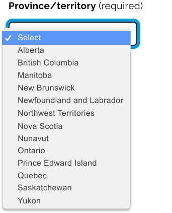
In all other cases, use the default option to repeat the label – this provides additional help to users with assistive devices like screen readers.
Example

Technical specifications
The user’s browser determines how the dropdown list looks and works. The browser’s default is most accessible (for example, it will support keyboard input in addition to pointing with the mouse), so do not add any customized styles to dropdown lists.
| Property | Mobile | Desktop |
|---|---|---|
| Border colour | #1A1A1A |
#1A1A1A |
| Border width | 2px |
2px |
| Height | 48px |
48px |
| Width | 100% |
100% and max-width: 736px |
Example
Dropdown lists (and all form input elements) must include a label with matching ID to be accessible. Please see the labels guidance to ensure your labels are accessible.
If you have any questions or feedback, please get in touch.