Loading indicator
Use a loading indicator to let users know when an application or page element needs more time to process an action.
-
Content:
@use '@ongov/ontario-design-system-global-styles/dist/styles/scss/1-variables/spacing.variables' as spacing; @use '@ongov/ontario-design-system-global-styles/dist/styles/scss/1-variables/colours.variables' as colours; @use '@ongov/ontario-design-system-global-styles/dist/styles/scss/1-variables/fonts.variables' as fonts; @use '@ongov/ontario-design-system-global-styles/dist/styles/scss/1-variables/font-weights.variables' as fontWeights; @use '@ongov/ontario-design-system-global-styles/dist/styles/scss/2-tools/functions/global.functions' as globalFunctions; $offset: 1, 200; $duration: 1.5s; $spinner-size: 3rem; $dasharray: 89, 200; .ontario-loading-indicator__overlay { position: fixed; width: 100%; left: 0; right: 0; top: 0; bottom: 0; background-color: rgba(colours.$ontario-colour-white, 0.7); z-index: 9999; &[aria-hidden='false'] { display: block; } &[aria-hidden='true'] { display: none; } } .ontario-loading-indicator { display: flex; flex-direction: column; align-items: center; justify-content: center; position: absolute; top: 50%; transform: translateY(-50%); width: 100%; height: 100%; p { color: colours.$ontario-greyscale-70; font-family: fonts.$ontario-font-raleway-modified; font-size: globalFunctions.px-to-rem(16); line-height: 1.5; font-weight: fontWeights.$ontario-font-weights-bold; word-spacing: 0.025rem; margin: spacing.$spacing-3 spacing.$spacing-0 spacing.$spacing-0; } } .ontario-loading-indicator__spinner { animation: rotator $duration linear infinite; width: $spinner-size; height: $spinner-size; overflow: visible; circle { stroke-dasharray: $offset; stroke-dashoffset: 0; stroke-linecap: round; stroke: colours.$ontario-greyscale-70; animation: dash $duration ease-in-out infinite; } } @keyframes rotator { 100% { transform: rotate(360deg); } } @keyframes dash { 0% { stroke-dasharray: $offset; stroke-dashoffset: 0; } 50% { stroke-dasharray: $dasharray; stroke-dashoffset: -35px; } 100% { stroke-dasharray: $dasharray; stroke-dashoffset: -124px; } } - URL: /components/raw/loading-indicator/loading-indicator.scss
- Filesystem Path: fractal/components/components/system-feedback/loading-indicator/loading-indicator.scss
- Size: 2.1 KB
-
Content:
.ontario-loading-indicator__overlay{position:fixed;width:100%;left:0;right:0;top:0;bottom:0;background-color:rgba(255,255,255,.7);z-index:9999}.ontario-loading-indicator__overlay[aria-hidden=false]{display:block}.ontario-loading-indicator__overlay[aria-hidden=true]{display:none}.ontario-loading-indicator{display:flex;flex-direction:column;align-items:center;justify-content:center;position:absolute;top:50%;transform:translateY(-50%);width:100%;height:100%}.ontario-loading-indicator p{color:#4d4d4d;font-family:"Raleway Modified","Open Sans","Helvetica Neue",Helvetica,Arial,sans-serif;font-size:1rem;line-height:1.5;font-weight:700;word-spacing:.025rem;margin:.75rem 0 0}.ontario-loading-indicator__spinner{animation:rotator 1.5s linear infinite;width:3rem;height:3rem;overflow:visible}.ontario-loading-indicator__spinner circle{stroke-dasharray:1,200;stroke-dashoffset:0;stroke-linecap:round;stroke:#4d4d4d;animation:dash 1.5s ease-in-out infinite}@keyframes rotator{100%{transform:rotate(360deg)}}@keyframes dash{0%{stroke-dasharray:1,200;stroke-dashoffset:0}50%{stroke-dasharray:89,200;stroke-dashoffset:-35px}100%{stroke-dasharray:89,200;stroke-dashoffset:-124px}} - URL: /components/raw/loading-indicator/loading-indicator.css
- Filesystem Path: fractal/components/components/system-feedback/loading-indicator/loading-indicator.css
- Size: 1.2 KB
When to use this component
Use a loading indicator when there is a process that requires more than 1 second to complete. This reassures the user that the system is still processing any ongoing requests.
This may include any operation that may run for an extended period of time, such as:
- loading asynchronous page elements (for example, data-heavy components)
- submitting a form
- saving updates
More than 8 seconds
In requests that take more than 8 seconds, use a loading indicator and include microcopy that indicates that the system is still processing any ongoing requests.
The copy can provide additional clarity to let the user know why they are waiting.
Usage
Place the loading indicator where the user expects the focus to be. There are two ways this can be done:
- action resulting in a new page, screen or view
- action happening within an element of the current page, screen or view
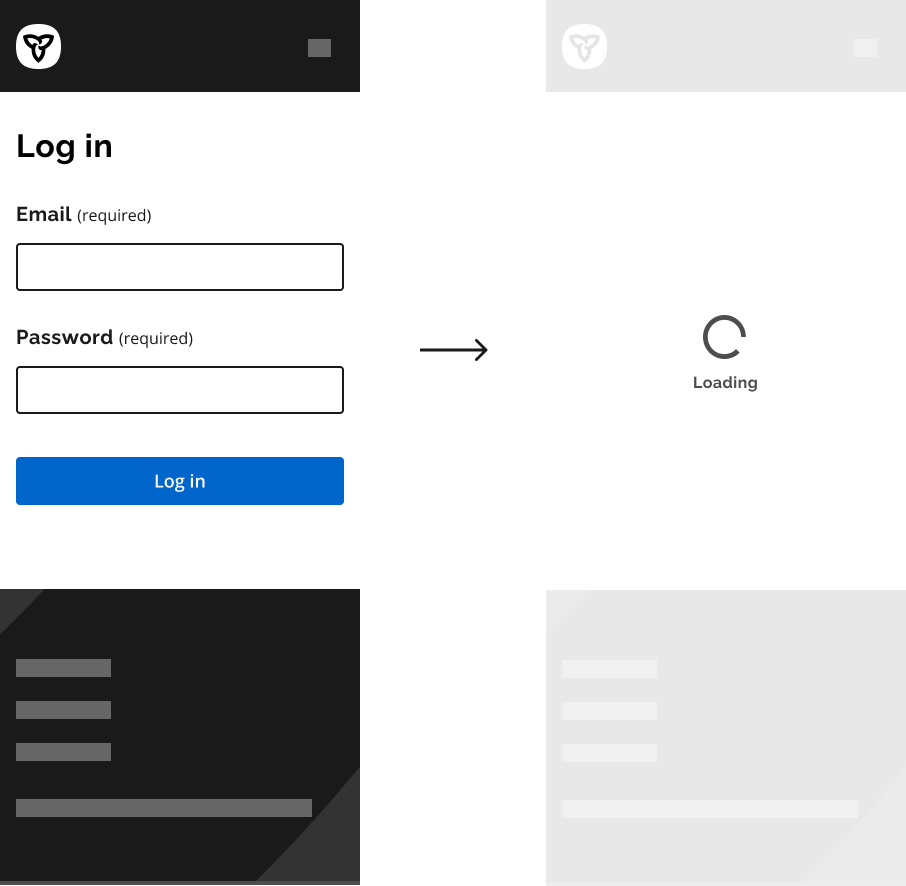
Action resulting in a new page, screen or view
When you are loading an entirely new page, screen or view (for example, after clicking “next”), place the loading indicator at the centre of the main content area to indicate that it is loading the entire page’s content.
Example
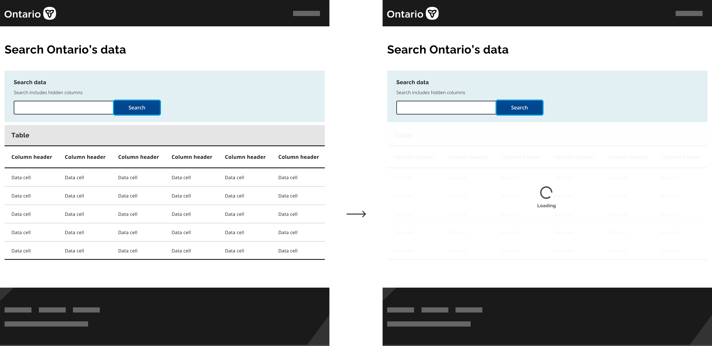
Action happening within an element of the current page, screen or view
When the action is taking place on the same page, screen or view (asynchronous call), attach a loading indicator to a container.
The container could be a search field, button or any other component to indicate the process applies to that particular item.
Place the loading indicator where the user’s attention will be after the action is complete.
Example
In a search field, align the indicator to the left so that it matches where text will appear.
Example

Microcopy
It can be helpful to include microcopy that tells the user what is happening or why the user is waiting.
This can include a quick phrase that describes the process, such as:
- “Loading”
- “Connecting”
If the process takes 8 seconds or more, dynamically update the phrase with additional clarifying copy, such as:
- “Processing data”
- “Finding your location”
- “Retrieving data”
- “16%”
- “Step 1 of 5”
Try out different wording and test with users to find the best option for your service.
Best practices
Do
- Limit text to 3 lines maximum for the default loading indicator.
- Limit text to 1 line maximum for the small loading indicator.
- Use sufficient contrast between the loading indicator text and the background.
- Always show the loading indicator for a minimum of 1 second. Having it display for less than one second may be distracting and cause concern about what flashed on the screen.
Don’t
- Use a loading indicator for decorative purposes.
- Use a loading indicator if the action reliably takes less than 1 second to load.
- Stop the animation of a visible loading indicator — users may think the page is frozen.
Technical specifications
| Specifications | Style | Colour | Size | Text |
|---|---|---|---|---|
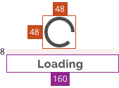
|
Default loading indicator | Greyscale-70 #4D4D4D |
Spinner: 48px by 48px Textbox: 160px |
Font: Raleway modified Size: 16px Line height: 1.5 Weight: 700 Spacing: 0.025rem |

|
Small loading indicator | Greyscale-70 #4D4D4D |
Spinner: 24px by 24px Textbox: Inherit |
Font: Inherit |
The overlay/loading indicator component is styled to be visible when the aria-hidden attribute is set to false, and hidden when the aria-hidden attribute is set to true.
Accessibility
As shown in the coded example, the loading indicator should be inside a container – for example a <div>. That container and its contents should be hidden by aria-hidden.
<div>
    <img class="spinner" />
    <span>Loading</span>
</div>
The hidden attribute should be on the div so the indicator behaves as one entity.
The aria attributes should be set on the containing element as follows:
-
aria-hiddenset totruewhen the loading indicator is not visible -
aria-hiddenset tofalsewhen the loading indicator is visible -
role="alert"andaria-live="assertive"so a screen reader user can be notified when the loading indicator starts on a page
If you have any questions or feedback, please get in touch.