Combobox
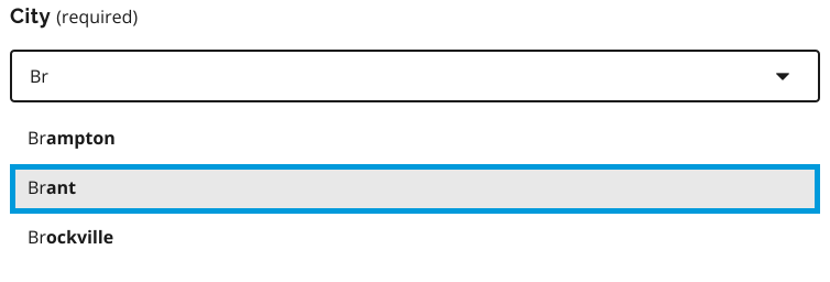
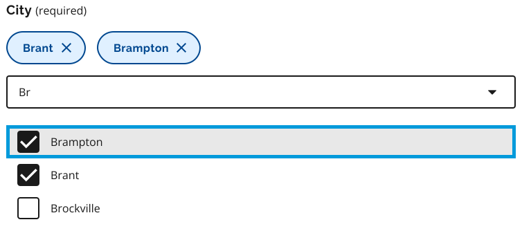
A search combobox combines a text input with a list of predefined options, allowing users to search, filter and make a selection.
Using a work in progress component
This version is a work in progress and has not been finalized for the Ontario Design System. It currently includes early-stage Figma designs and preliminary guidance, but no corresponding code.
Teams may use this component as a starting point but may need to conduct additional research and adapt the designs for their specific needs.
Example 1: Single-select
Example 2: Multi-select
To request access to the work in progress component file, email design.system@ontario.ca.
When to use this component
Use a search combobox when:
- users need to select one or more options from a list of 15 or more items
- if the list contains fewer than 15 items and users only need to select a single option, use the standard dropdown list component instead
- scanning all options at once would be slow or overwhelming
- users may not know the exact option name but can find it by typing part of it
When not to use this component
Do not use a search combobox when:
- there are only a few options that can easily be displayed as radio buttons or a standard dropdown
- users are expected to enter free-form text rather than select from predefined options
- users need to carefully review and compare all available options before making a selection, as filtering can hide relevant choices
Best practices
When designing or implementing a search combobox:
- ensure the input and option list are keyboard accessible, including navigation, selection and closing the options list
- use clear and consistent option labels that reflect how users think
- for search interactions:
- show suggestions as soon as the user enters the first valid character
- show a helpful empty state when no results match the user’s input
- do not automatically submit when a suggestion is selected; only perform the action after the user explicitly confirms it (for example, by clicking a Search button)
This guidance is not comprehensive. You may need to do additional research to ensure the component meets user needs and aligns with best practices.
Share your findings
If your team uses or tests this early version, we encourage you to share your findings with us. Your feedback supports the future development of the component.
Email us at design.system@ontario.ca.
If you have any questions or feedback, please get in touch.