Tabs
Use in-page tabs to organize related content into multiple sections within the same page, allowing users to switch between sections without navigating away.
Using a work in progress component
This version is a work in progress and has not been finalized for the Ontario Design System. It currently includes early-stage Figma designs and preliminary guidance, but no corresponding code.
Teams may use this component as a starting point but may need to conduct additional research and adapt the designs for their specific needs.
Design example
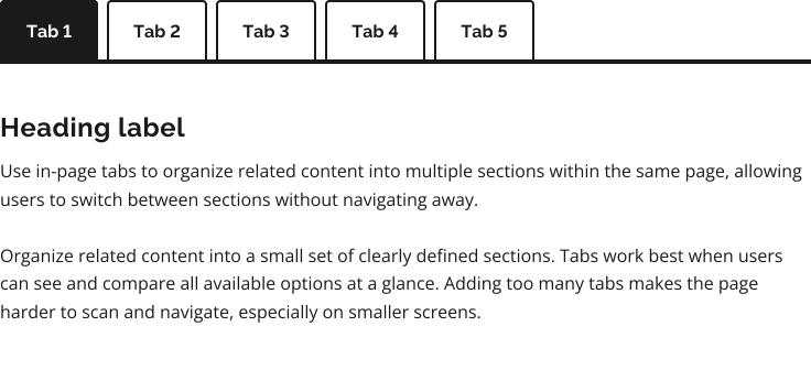
To request access to the work in progress component file, email design.system@ontario.ca.
When to use this component
Use in-page tabs to organize related content into a small set of clearly defined sections. Tabs work best when users can see and compare all available options at a glance. Adding too many tabs makes the page harder to scan and navigate, especially on smaller screens.
Use tabs when:
- content can be logically divided into distinct, labelled sections
- the sections are closely related and belong to the same topic or task
- for a page titled “Cases”:
- good example of tabs: “Current”, “Upcoming”, “Past”
- bad example of tabs: “Current cases”, “Eligibility”, “Miscellaneous”
- for a page titled “Cases”:
- switching between sections does not require saving or submitting data
When not to use this component
Do not use this tab design for navigating between pages. This design is intended to switch between related views within the same page.
Tabs hide content and are not suitable for all situations.
Do not use tabs when:
- you need to indicate progress or the content is step-based, such as a form (use a step-by-step flow instead)
- sections are too complex or lengthy (consider using separate pages or other ways of splitting the content)
- users need to compare content side by side, requiring frequent back-and-forth switching
Best practices
When designing or implementing tabs:
- keep the number of tabs manageable so users can quickly scan and navigate between options
- select a default tab that is most relevant to the user’s task; this should typically be the first tab
- avoid duplicating the same content across multiple tabs
- support direct links to individual tabs
- use short, clear labels that describe the content in each tab
- keep labels consistent in style and length
Share your findings
If your team uses or tests this early version, we encourage you to share your findings with us. Your feedback supports the future development of the component.
Email us at design.system@ontario.ca
If you have any questions or feedback, please get in touch.